

Responsive Web Design improves your website’s SEO performance by making it mobile-friendly, fast, and user-focused across all devices. It helps Google rank your pages higher through mobile-first indexing, better Core Web Vitals, and improved engagement. By using responsive layouts, optimized media, and clean structure, you reduce bounce rates, increase user experience, and strengthen your overall SEO strategy in 2026.
Table of Contents
- Understanding Responsive Web Design
- How Responsive Design Enhances User Experience (UX)
- SEO Benefits of Responsive Web Design
- Technical Implementation of Responsive Design
- Integrating SEO Strategies with Responsive Design
- Future-Proofing Your Website
- Case Studies & Real-World Examples
- Actionable Tips & Checklist for Webmasters
- Conclusion
- Frequently Asked Questions (FAQs)
Understanding Responsive Web Design
What Is Responsive Web Design?
Responsive web design is a web development approach that ensures your website adapts seamlessly to any device, whether it’s a desktop, tablet, or mobile phone. Unlike static design, which stays fixed, or adaptive design, which uses multiple layouts for different devices, responsive design relies on flexible grids, fluid images, and CSS media queries to automatically adjust the layout.
Implementing responsive design improves user experience, maintains brand consistency, and enhances SEO performance, as search engines like Google prioritize mobile-friendly websites in their rankings. For beginners, learning the basics of SEO basics can help you understand how responsive design fits into your broader SEO strategy.
Key Benefits:
- Enhanced usability across all devices
- Faster page load times, boosting engagement
- Reduced bounce rates and improved search rankings
Why Your Website Must Be Mobile-Friendly in 2026
With mobile devices accounting for the majority of web traffic, ensuring your website is mobile-friendly has never been more important. Studies show that over 60% of global internet users access websites primarily through their smartphones, and this trend is expected to grow further in 2026.
Google’s mobile-first indexing means the search engine predominantly uses the mobile version of your site for ranking and indexing. Websites that aren’t optimized for mobile risk lower visibility in search results, reduced engagement, and higher bounce rates.
Many businesses still ignore mobile optimization, giving you an opportunity to gain a competitive edge. Implementing responsive design, optimizing page speed, and testing mobile usability can significantly improve user experience, increase conversions, and strengthen your SEO strategy.
For deeper insights into optimizing your pages, check out strategies for effective SEO to understand how mobile optimization interacts with broader SEO practices.
Key Points:
- Mobile devices dominate web traffic and user behavior
- Google prioritizes mobile-friendly sites in search rankings
- Optimizing for mobile closes competitor gaps and boosts engagement
How Responsive Design Enhances User Experience (UX)
Core UX Benefits
Responsive web design directly improves user experience (UX) by making websites easier to navigate and interact with across all devices. A well-implemented responsive design ensures:
- Easy navigation & touch-friendly interface: Menus, buttons, and interactive elements adjust for both desktop and mobile, allowing users to browse effortlessly.
- Readable typography & layouts: Text and content automatically resize for clarity, ensuring users can read without zooming or horizontal scrolling.
- Smooth interaction & scroll performance: Fluid grids and adaptive images maintain consistent speed and responsiveness, creating a seamless browsing experience.
Key elements of responsive UX include:
- Fluid grids that adjust content proportionally
- Adaptive images that resize without distortion
- Intuitive menus for quick access to information
A mobile-friendly, user-centric design not only keeps visitors engaged but also positively impacts SEO, as search engines like Google reward sites with better UX. For practical tips on improving overall website performance, explore our effective website design showcase for examples of effective responsive layouts.
Accessibility Advantages
Responsive web design also ensures your website meets accessibility standards, such as WCAG compliance, readable fonts, and sufficient color contrast. Making your website accessible allows a wider audience, including users with disabilities, to navigate and interact comfortably. In addition to improving user experience, accessibility can help your business stay compliant with legal requirements and build a positive brand reputation.
User Retention & Engagement
A well-optimized responsive website encourages user retention and engagement by reducing bounce rates and increasing dwell time. Visitors are more likely to return to a website that is easy to navigate, visually consistent, and performs smoothly across all devices. Enhancing engagement not only strengthens brand trust but also signals to search engines like Google that your site provides value, boosting SEO performance.
For actionable strategies to retain visitors and boost engagement, you can refer to responsive website engagement techniques to see practical examples of user-focused responsive design implementations.
SEO Benefits of Responsive Web Design
Implementing responsive web design provides multiple SEO advantages. By having a single, mobile-optimized version of each page, you consolidate link equity, avoid duplicate content issues, and improve crawling and indexing by search engines like Google.

Google and Mobile-First Indexing
For websites aiming to improve SEO, understanding mobile-first indexing is crucial. Google now primarily uses the mobile version of your website for ranking and indexing, so ensuring your site is fully optimized for mobile devices is essential. For expert guidance on consolidating your site’s SEO effectively, visit our website to learn practical strategies
When managing URLs, consider the following:
- Single URLs per page ensure all traffic and ranking signals consolidate in one place.
- Multiple URLs for desktop and mobile can split SEO authority, reducing overall link equity.
- Many competitors still fail to consolidate URLs, creating an opportunity to outperform them.
Page Speed and Core Web Vitals
Page speed and Core Web Vitals are crucial for both user experience and SEO performance. Slow-loading pages frustrate visitors, increase bounce rates, and can negatively impact rankings on Google. Optimizing your website with techniques such as optimized images, lazy loading, and minimized scripts ensures smooth performance across all devices.
Core Web Vitals metrics measure the real-world user experience:
- Largest Contentful Paint (LCP): Time taken for the main content to load
- First Input Delay (FID): Responsiveness to user interactions
- Cumulative Layout Shift (CLS): Visual stability of page elements during loading
Ensuring strong Core Web Vitals scores not only improves UX but also strengthens your SEO authority. For actionable tools and strategies to enhance website performance, check out Google Search Central for expert guidance.
Content Consistency & Crawlability
Maintaining content consistency across your website is essential for better crawlability and SEO performance. When content is structured and uniform, search engines like Google can index pages more efficiently, ensuring all your important pages are discoverable.
Key practices include:
- Easier indexing: Consistent content and clear site structure help search engines navigate your site smoothly.
- Reduced duplicate content: Avoid repeating similar content across pages to prevent ranking penalties.
- Structured data & schema integration: Using schema markup enhances how search engines interpret your content, making it eligible for rich results and improving visibility.
By following these practices, you improve search engine understanding of your website, reduce errors during crawling, and strengthen overall SEO performance.
Conversion Rate Improvements
Responsive web design directly impacts conversion rates by making key actions easy and accessible across all devices. Optimized layouts ensure that CTAs (Call-to-Action) are visible and that click-to-call buttons work seamlessly on mobile devices, increasing the likelihood of user interaction.
Other essential practices include:
- Mobile checkout optimization: Simplified forms and fast-loading payment pages reduce friction, making it easier for users to complete purchases.
- Form optimization: Responsive forms adapt to screen sizes, improving usability and reducing abandoned submissions.
By focusing on these responsive design elements, businesses can see higher conversion rates, better engagement, and stronger brand trust, while also supporting SEO goals by reducing bounce rates and improving dwell time.
Technical Implementation of Responsive Design
Frameworks & Tools
Implementing responsive design effectively requires the right frameworks and tools. Popular CSS frameworks like Bootstrap, Foundation, and Tailwind CSS provide flexible grids and pre-built components that make responsive layouts easier to create. For CMS-based websites, responsive themes for WordPress or Shopify allow businesses to implement mobile-friendly designs quickly without heavy coding.
To ensure your website works flawlessly across devices and browsers, consider using cross-browser testing tools such as BrowserStack or Responsinator. These tools simulate different screen sizes and environments, helping you identify layout issues, broken elements, or usability problems before they impact your visitors.
Best Practices for Developers
To implement responsive design effectively, developers should follow proven best practices that improve both user experience and SEO performance.
Key practices include:
- Mobile-first approach: Design for smaller screens first, then scale up to larger devices to ensure optimal performance across all devices.
- Fluid grids & scalable images: Use flexible layouts and images that adapt to screen sizes to maintain visual consistency.
- Meta viewport tags & semantic HTML: Proper meta tags and structured HTML ensure correct scaling and improve accessibility and crawlability.
- Monitoring page speed & analytics: Track performance metrics using tools like Google Analytics or PageSpeed Insights to identify issues and optimize continuously.
Following these practices helps developers create websites that load faster, retain users, and rank higher in search engines.
Avoiding Common Mistakes
Even with a responsive design, websites can lose SEO value and user engagement if common mistakes are overlooked. Paying attention to these pitfalls ensures your site performs optimally across all devices.
Common mistakes to avoid:
- Neglecting mobile users: Ignoring mobile design can lead to high bounce rates and poor rankings.
- Heavy images and scripts: Large files slow down page speed, affecting both UX and SEO.
- Improper redirects & duplicate URLs: Failing to consolidate URLs or using incorrect redirects can split SEO authority.
- Ignoring Core Web Vitals: Metrics like LCP, FID, and CLS impact rankings and user satisfaction.
By proactively addressing these issues, you ensure a fast, user-friendly, and SEO-optimized website that delivers strong engagement and rankings.
Integrating SEO Strategies with Responsive Design
On-Page SEO
Integrating SEO strategies with responsive design ensures that your website performs well for both users and search engines. Proper on-page SEO helps search engines understand your content while enhancing user experience.
Key practices include:
- Internal linking: Use relevant links to pages like SEO Basics for Beginners and On-Page & Off-Page SEO to distribute authority and improve crawlability.
- Optimized headings, meta tags, and ALT text: Clear, keyword-rich headings and descriptive ALT text help search engines interpret content and improve accessibility.
- LSI keyword usage: Incorporating related keywords naturally enhances context and increases the chances of ranking for multiple search queries.
By combining responsive design with strong on-page SEO, you can improve rankings, user engagement, and overall website performance.
Off-Page SEO Considerations
Off-page SEO plays a crucial role in enhancing your website’s authority and rankings, especially when combined with a responsive design. Mobile-friendly pages that load quickly and provide a seamless user experience are more likely to earn high-quality backlinks and engagement from visitors.
Key practices include:
- Backlinks pointing to mobile-friendly pages: Ensure your link-building strategy targets pages that are fully responsive to maximize SEO benefits.
- Social sharing and mobile engagement: Optimizing content for mobile devices encourages sharing on social platforms, driving traffic, and improving brand visibility.
By aligning off-page SEO efforts with a responsive design strategy, you strengthen your website’s authority, improve user engagement, and enhance search engine rankings.
Local SEO Optimization
Responsive design also supports local SEO optimization, ensuring your website performs well for users searching for nearby businesses. Mobile-friendly sites make it easier for visitors to interact with your business and for search engines to rank your pages locally.
Key practices include:
- Click-to-call buttons: Allow mobile users to contact your business instantly, improving conversions and engagement.
- Google Maps integration: Embedding your business location helps users find you quickly and improves local search visibility.
- Location-based keywords: Using city, neighborhood, or region-specific keywords helps search engines connect your website with local searches.
Implementing these local SEO strategies on a responsive website enhances user experience, increases foot traffic, and improves local search rankings.
Future-Proofing Your Website
Voice Search Optimization
With the rise of voice assistants like Google Assistant, Siri, and Alexa, optimizing your website for voice search is becoming essential. Voice queries are usually conversational and longer, so content must align with how people naturally speak.

Key practices include:
- Conversational keywords: Use long-tail, question-based phrases that match natural speech patterns.
- Structured data: Schema markup helps search engines understand your content context, improving chances for rich results.
- Featured snippet compatibility: Optimizing for snippets increases the likelihood your answers will be read aloud by voice assistants.
By preparing your responsive website for voice search, you ensure it stays relevant and accessible as search behavior evolves, improving both user experience and SEO performance.
Wearables & Emerging Devices
As technology evolves, websites must adapt to emerging devices like smartwatches, AR glasses, and other wearables. Responsive design ensures your content is accessible and engaging, even on small screens with limited interaction space.
Key considerations include:
- Small screens & micro-interactions: Optimize layouts and touchpoints for tiny screens to maintain usability and engagement.
- Fast-loading, precise content delivery: Prioritize loading speed and concise information for devices with limited display and processing capabilities.
By preparing your website for wearables and emerging devices, you future-proof your user experience while supporting strong SEO performance across all platforms.
Long-Term Maintenance Benefits
Responsive web design not only improves UX and SEO but also simplifies long-term website maintenance. By having a single, unified codebase for all devices, managing and updating your website becomes more efficient.
Key benefits include:
- Single update for all devices: Changes made once apply across desktops, tablets, and mobile devices, saving time and reducing errors.
- Reduced development cost & faster updates: Maintaining one responsive site lowers ongoing development costs and allows quicker implementation of improvements or new features.
Focusing on these maintenance advantages ensures your website remains scalable, cost-effective, and optimized for users and search engines over time.
Case Studies & Real-World Examples
Real-world examples show how responsive web design can directly improve SEO performance, user engagement, and website speed. Businesses that implement responsive design often see measurable improvements in search rankings, traffic, and user behavior.
Dublin Technology Center Example: Growth, Engagement, Load Times
A well-known example comes from the Dublin Technology Center, which redesigned its website using a responsive framework to improve performance across devices.
After implementing responsive web design, the organization experienced several improvements:
- Faster page load times on mobile and tablet devices
- Improved user engagement across different screen sizes
- Better mobile usability and smoother navigation
- Increased visibility in search results
These improvements helped the website provide a consistent experience for users regardless of the device they were using.
Before vs After Stats (Bounce Rate, Dwell Time, Traffic)
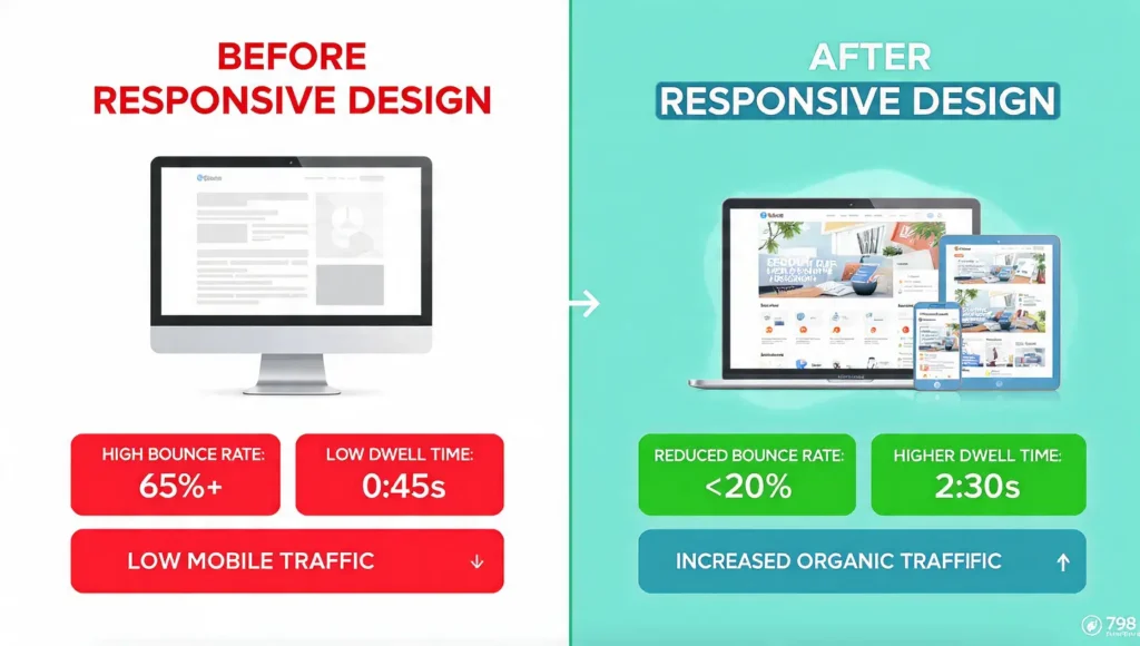
When comparing the website performance before and after responsive design implementation, the results were noticeable:
Before Responsive Design
- High bounce rate from mobile users
- Slow page load speeds
- Lower average session duration
- Limited mobile traffic
After Responsive Design
- Reduced bounce rate as mobile usability improved
- Longer dwell time due to better navigation and readability
- Faster page load speeds across devices
- Increased organic traffic from mobile search
These metrics demonstrate how responsive design can positively influence user behavior signals, which are important for SEO performance.
Highlight Measurable SEO Results
Responsive web design contributes to SEO success by improving both technical performance and user experience. Measurable SEO benefits include:
- Higher rankings in mobile search results
- Improved Core Web Vitals performance
- Increased organic traffic from mobile users
- Better engagement metrics, such as dwell time and page views
When a business uses responsive web design, it builds a website that works smoothly for both users and search engines, helping achieve better and long-lasting SEO performance.
Actionable Tips & Checklist for Webmasters
Implementing responsive web design effectively requires a combination of technical optimization, user experience improvements, and ongoing SEO monitoring. The following checklists help webmasters ensure their websites perform well across devices while maintaining strong search engine visibility.
Quick Technical Checklist for Responsive Websites
To build a technically sound responsive website, make sure the core development elements are properly implemented.
- Use a mobile-first design approach so the site performs well on smaller screens.
- Implement fluid grids and flexible layouts that adjust automatically to different screen sizes.
- Add a meta viewport tag to ensure proper scaling on mobile devices.
- Use responsive images that resize according to screen resolution.
- Test the website across multiple devices and browsers to ensure compatibility.
UX & Accessibility Checklist
User experience and accessibility play a crucial role in engagement, usability, and SEO performance.
- Ensure clear navigation menus that are easy to use on mobile screens.
- Maintain readable font sizes and sufficient spacing for better usability.
- Optimize touch elements such as buttons and links for mobile interaction.
- Use accessible color contrast so content is readable for all users.
- Provide alt text for images to improve accessibility and search visibility.
SEO Optimization Checklist
Responsive design supports SEO when important on-page elements are properly optimized.
- Maintain a single URL structure for each page to avoid duplication issues.
- Use clear and structured headings (H1, H2, H3) to organize your content so it’s easy to understand for both users and search engines.
- Use structured data and schema markup where needed.
- Ensure internal links are properly placed within content to improve crawlability.
- Optimize meta titles and descriptions for better search visibility.
Performance & Core Web Vitals Monitoring Tips
Website performance directly affects rankings and user satisfaction, especially on mobile devices.
- Compress and optimize images and media files.
- Enable lazy loading for images and videos.
- Minimize CSS, JavaScript, and unused code.
- Monitor page speed and performance metrics regularly.
- Track Core Web Vitals indicators such as loading speed, interactivity, and visual stability to maintain optimal performance.
Conclusion
Responsive web design is essential for modern SEO success. It improves mobile usability, page speed, user experience, and search rankings by ensuring your website adapts smoothly to all devices. A responsive design reduces bounce rates, increases engagement, and helps search engines crawl and index your pages more efficiently.
Frequently Asked Questions (FAQs)
What is Responsive Web Design?
Responsive web design is a web development approach that allows a website to automatically adjust its layout, images, and content based on the user’s screen size and device. This ensures that the website provides an optimal viewing experience on desktops, tablets, and smartphones without requiring separate versions of the site.
Can a Non-Responsive Website Hurt SEO?
Yes, a non-responsive website can negatively affect SEO. If a website does not display properly on mobile devices, users may leave the page quickly, increasing the bounce rate. Search engines prioritize mobile-friendly websites, so a poor mobile experience can lead to lower rankings and reduced organic traffic.
How Does Mobile-First Indexing Work?
Mobile-first indexing means that search engines primarily use the mobile version of a website for crawling and indexing. If a website is not optimized for mobile devices, it may struggle to rank well in search results. Responsive web design helps ensure that the mobile version of a site performs effectively for both users and search engines.
Does Responsive Design Improve Core Web Vitals?
Responsive design can help improve important performance metrics like page loading speed, visual stability, and interactivity. By optimizing images, layouts, and code for different devices, websites can achieve better performance scores, which contribute to improved user experience and SEO performance.
How Does Responsive Design Help Local SEO?
Responsive websites improve local SEO by making it easier for mobile users to access location-based information, such as contact details, maps, and click-to-call buttons. Since many local searches are performed on smartphones, a mobile-friendly design increases the chances of attracting nearby customers.
What Frameworks or Tools Are Best for Responsive Design?
Several frameworks and tools help developers build responsive websites more efficiently. Popular options include Bootstrap, Tailwind CSS, and responsive themes available in content management systems like WordPress and Shopify. Developers also use testing tools to ensure that websites perform well across different screen sizes and browsers.